This blog post covers:
- What idents are
- How long they usually last
- How many there usually are
- The difference between Big 5 and Indie
- The point of an ident
- Some influences
- Titles in movies - Font, size and colour
- Examples from different film openings
- Semiotics rap
IDENTS
WHAT ARE IDENTS?
Idents are essentially the logo of a production company which is played at the beginning of a movie. They are the most simple aspect of a film opening. An ident usually lasts between 4-7 seconds and there are usually 2-4 idents before the movie starts. The more production companies involved in making the movie, the more the risks are spread. Indie movies occasionally have no idents at the beginning. The bigger conglomerates such as the Big 5 (Warner Bros., Paramount, NBC Universal, Sony and Walt Disney) get a lot more screen time for their idents rather than smaller junior companies. The Big 5 are also more likely to have their own jingle rather than an audio bridge.
They are placed at the beginning of a movie to show which production companies were involved in the making of the movie. Idents are also used to advertise the production company. Idents are often made aesthetically pleasing and enticing to make them memorable. The fact that Big 5 idents are repeatedly marketed also helps to make them memorable. The production company wants to make a good impression so that people are tempted to watch more of their creations. Idents can also be altered to connote the genre of the movie. This is mostly identifiable with the Slasher genre.
VODCAST
...
...
POSSIBLE INFLUENCES
- Having possibly 1 or 2 idents with their own jingle
- Having 1 ident with audio bridge to movie
- Considering our film opening can't be that long, probably a maximum of 10 seconds per ident
- Possibly having something altered about the ident to connote the zom-rom-com hybrid genre
COMMON IDENTS
...via GIPHY
...
...
via GIPHY
...
...
via GIPHY
...
...
...
...
...
TITLES
In this vodcast, I speak about the titles in different movies. I've looked at some Working Title movies as well as Warp movies. It is clear that a title is very important as it anchors the genre and the preferred reading. This is shown through the font, colour, size and case. It is interesting as a few movies don't have any titles at all. The order is also important to look at as this will help us create our film opening. I look at Tyrannosaur (Considine, 2011), This is England (Meadows, 2007) and Four Lions (Morris, 2010) from Warp and Bridget Jones's Diary (Maguire, 2001) from Working Title.
...
...
FILM OPENING EG
PRETTY IN PINK (DEUTCH, 1986)
...
...
Idents
BABY DRIVER (WRIGHT, 2017)
...
...

Idents, Companies & Production Context
SONY

WORKING TITLE


Ident 3

THE WORLD'S END

INDIE MOVIE IDENTS
SMOKIN' ACES

FILM OPENING EG
PRETTY IN PINK (DEUTCH, 1986)
...
...
Idents
- Only one company ident (Paramount Pictures)
- Now usually a few company idents
Titles
- Wording, font use, order - all very important
- In older movies, usually all put at the end
Titles in order
(If in bold - bigger font size)
- PARAMOUNT PICTURES PRESENTS (all upper case and sans-serif - less likely to connote sophistication) - Black and white connoting seriousness / drama genre. Polysemic title - sans-serif font with white on black.
- A JOHN HUGHES PRODUCTION (all upper case, sans-serif). Expected auteur theory however usually "Film" and not "Production".
Shots
- Exposition shot - narrative enigma. Some degree of context - a working class area (grass growing over pavement, rusty car, broken roads)
- Panning shot showing both sides of the track - Born/from the wrong side of the tracks - One side is a nice area than the other.
 |
| Baby Driver |
...

Idents, Companies & Production Context
- 4 idents
- Sony - 14.12 seconds
- Tristar - 13.58 seconds
- MRC (Media Rights Capital) - 8.28 seconds
- Working Title - 12.53 seconds
- Average length - 12.13 seconds
- Sony, MRC, (maybe Working Title) - simple idents
- Tristar, (maybe Working Title) - complex idents
- Order - Sony, Tristar, MRC, Working Title
- Tristar is a Sony subsidiary so it makes sense to put Sony before

- Black screen until the O in Sony begins to appear
- Roughly 6 seconds in, a high pitched note plays at the same time a ray of light makes the other letters visible
- All letters turn white, then a fade of light blue to white to dark blue
- Zoom into the letter O and rumbling noise and bells play
- High pitched noise still plays
TRISTAR


- Dark shapes which look like trees until another ray of light shows and the set becomes light and shows white fluffy clouds
- White pegasus runs from extreme long shot until a long shot
- Swoosh sound as pegasus opens its wings
- 'Tristar' appears above and behind the pegasus in a gold, bubble, sans-serif font and 'a Sony company' appears in a smaller gold, bubble, sans-serif font below
- Pegasus goes into slow motion as titles appear
- Swoosh again as it fades to black
- High pitched noise continues throughout
MRC


- Blue box appears from left to right
- Letters and box fades into view and focuses
- Fade to black after
- High pitched noise still playing
WORKING TITLE

- Circular orange light appears
- White chalk or pencil drawing a circle in this orange spot
- Drawing turns into blue rings
- Blue rings spin around and the working title font in white appears
- Swoosh sfx when blue rings start spinning
- Ringing sound continues throughout
- Fade to black
- Ringing audio bridges into first scene
Titles
- Titles start at 6:23
- End of song Bell Bottoms playing as titles appear - song fades out
- Tristar Pictures and MRC present
- Sans serif stencil font in white, all upper case but 'and' and 'present' in a smaller font than 'tristar pictures' and 'mrc'
- Thin yellow strip underneath 'Tristar Pictures and MRC' and above 'present'
- Appears the same time a tyre screech sound effect
- Line comes from the right of the screen and the words come out from the line
- Font gets bigger until it fades out

- Again another yellow line comes in from the left of the screen
- 'A working title' on the top, 'big talk pictures production' underneath
- Same font
- 'working title' and 'big talk pictures' in a bigger font than 'a' and 'production'
- Font gets bigger until it fades out
- Again another yellow line comes in from the right of the screen but goes into the middle of the screen
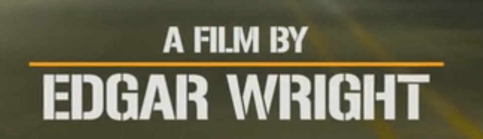
- 'a film by' on top, 'Edgar Wright' underneath
- Same font
- Top line in a smaller font than the bottom line
- Font gets bigger until it fades out
MAINSTREAM MOVIE IDENTS
FRIDAY 13th REMAKE
FRIDAY 13th REMAKE
- Paramount
- 19 seconds
- Audio bridge

Ident 2
- Newline Cinema
- 14 seconds
- Audio bridge

Ident 3
- Platinum Dunes
- 15 seconds
- Audio bridge

THE WORLD'S END
- Focus Features
- 17 seconds
- Audio bridge
Ident 2
- Working Title
- 12 seconds
- Audio bridge

INDIE MOVIE IDENTS
SMOKIN' ACES

- WT2 - psuedo indie
- Total of 32 seconds
Ident 1
- Universal
- Own jingle
- 21 seconds
Ident 2
- Working Title
- Audio Bridge
- 11 seconds
WITHNAIL AND I


- 1987 - typical for older movies
- Total of 9 seconds
Ident 1
- Handmade Films presents
- 9 seconds
- Audio bridge
KIDULTHOOD


- 2006
- Total of 24 seconds
Ident 1
- Revolver Entertainment
- No audio
- 3 seconds
Ident 2
- Hanway Films
- No audio
- 9 seconds
Ident 3
- Stealth Films
- Own jingle
- 7 seconds
Ident 4
- Cipher Films
- Own jingle
- 5 seconds
HALLOWEEN REMAKE


- 2007
- Total of 12 seconds
Ident 1
- Dimension Films
- 12 seconds
- No sound / audio bridge
SEED OF CHUCKY


- No idents
- Titles and animated sequence
'71

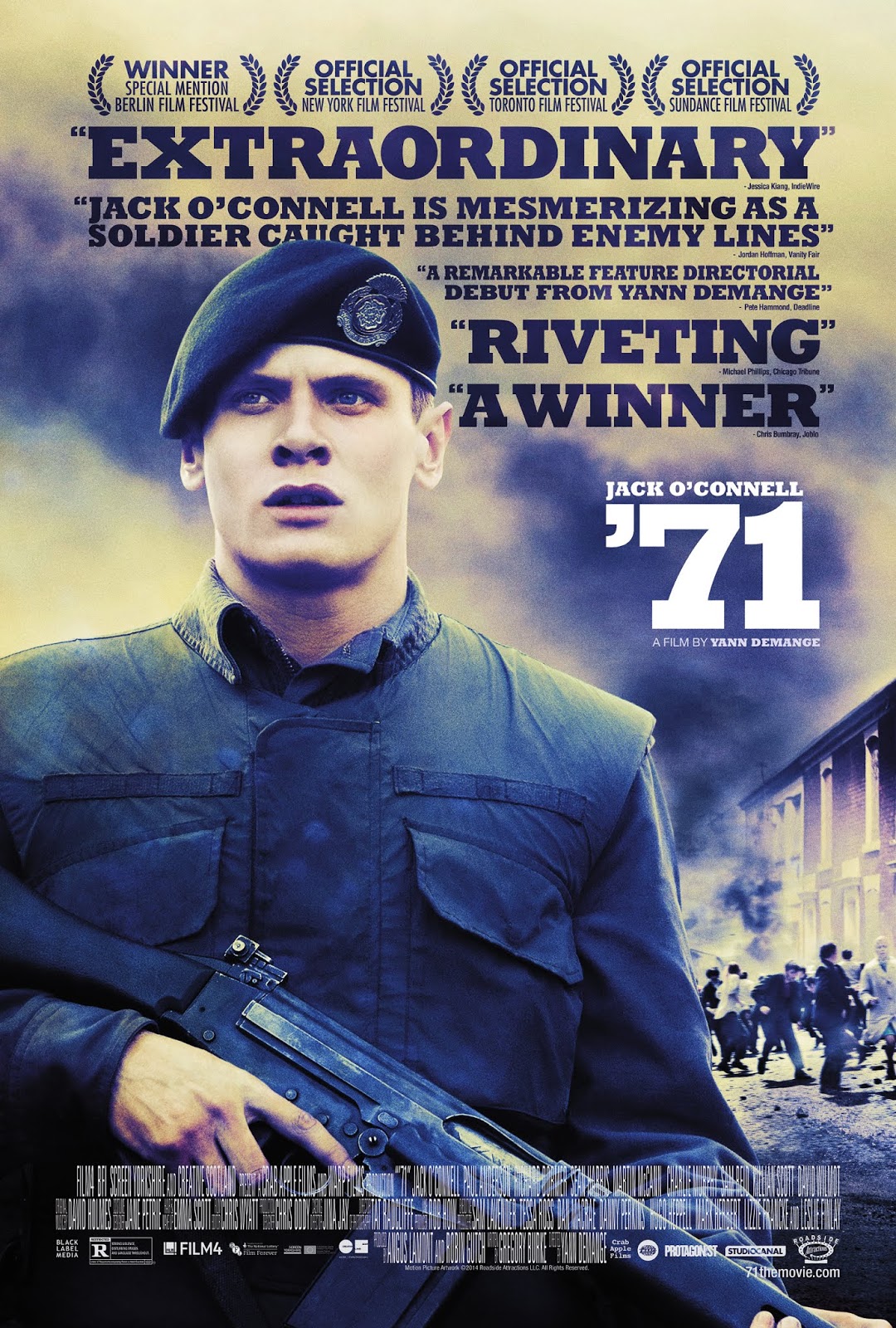
- £8m budget
- Total of 38 seconds
Ident 1
- Studio Canal (formerly Optimum Releasing)
- 19 seconds
- No audio
Ident 2
- Film 4
- 9 seconds
- No audio
Ident 3
- BFI
- 10 seconds
- No audio
SUBMARINE


- Total of 16 seconds
Ident 1
- Film 4
- 9 seconds
- Own jingle
Ident 2
- UK Film Council
- 7 seconds
- No audio
TYRANNOSAUR


- No idents
SEMIOTICS
APPLIED TO WARP POSTERS
TYRANNOSAUR
(This post was originally created by Spikey Films)
THE THEORY OF EVERYTHING

- Central framing (rule of thirds)
- Both characters set in the middle of the framing, clearly showing the protagonists.
- Also leaving space for the sky, connoting a romantic feel
- Plain colours (both the clothes and the rest of the cover follow a blue and black tone, therefore signifying the movie as a drama, with no comedy elements)
- Style of title (bold serif font, also helping to connote the drama theme)
- Background includes castle, which glamourises the upper-class life
- The physical contact between the characters connotes a love theme
- Facial expressions (look serious, therefore clearly not comedic)
- long-shot
SHAUN OF THE DEAD

- Main characters holding tools/sport equipment/flowers as weapon (makes its clear it is comedy)
- Flowers being held by female character (connotes rom-com theme)
- Zombies on screen clearly signifies what style of movie it is (zom-rom-com)
- making it a hybrid means it is approachable for more audiences (hybrid)
- widens the preferred reading (could include more negotiated reading and less oppositional reading)
- female holding the flowers (stereotyping)
- although she is also fighting (countertype)
BRIDGET JONES'S BABY

- Pink text connote romance
- Purple font contrasts the pink slightly, as the comedy element shines through
- Female character is centre of the screen, signifying she is the main character
- 2 males and a female connotes their could be a love triangle
- Females facial expression also contrasts the romance with comedy, as she does not look too serious
- Sans-serif bubble font, also clearly shows it isn't a film to be taken seriously
- Binary opposition between male and female
LEGEND

- Black and white split on screen (showing good and bad side)
- Character on black side does not cross over onto the other side, whereas Tom Hardy on the white side crosses over onto the white, connoting he could be an anti-hero
- Bold non-serif font
- Suited up, therefore glamourising the upper-class once again
- Hand in pockets, showing a serious vibe
- man in a suit (stereotyping)
SEMIOTICS RAP
MY VERSES
APPLIED TO WARP POSTERS
TYRANNOSAUR
 |
| Tyrannosaur poster |
- Rule of thirds, centrally framed connoting this man as the protagonist
- However, prop (wooden baseball bat), lighting, mise-en-scene etc connote he could be the antagonist
- Own binary opposition - creating narrative enigma
- Serif font signifying a drama genre
- Wrinkles - older man - older audience
- Skin head, vest top - working class
- Terraced houses on edge of poster - working class
- Dark weather - drama
- High key lighting on only one side - reflects his two different personalities - drama
- Small 'a film by Paddy Considine' denotes auteur theory
- 2 awards won & reviews to lead promotion
- High angle - surprising for protagonist
- Bare tree - drama
- Violence - in this shot - violence to himself - self-loathing
- Contemplating - not stupid like the stereotypical working class
- Narrative enigma - what is he regretting?
- Names but not big or bold
- All upper case
LE DONK AND SCOR-ZAY-ZEE
 |
| Le Donk & Scor-zay-zee poster |
- Bright colours with title, stars, graffiti (not serious)
- Fat character signifies comedy in this case
- Wearing scruffy clothes, therefore not glamourising the working-class
- Underwear hanging connotes a comedy genre
- Setting = covered in graffiti (connotation of rough area) + (typical warp)
- Intertextual reference of 'Spinal Tap'
- Stereotypes = short hair, relatively masculine colours
- rule of thirds - centred on the cover (protagonist)
- more inviting as character is directly referencing the character with hand gesture
- Text = scruffy serif font
- Narrative enigma as we don't know who the character is + his eyes are covered by sunglasses
- Long-shot/extreme long-shot
- Mid angle
- Shane Meadows made clear on cover = denotes the auteur theory
- Small text showing the actors (not famous actors, therefore no need to have their names clear on the cover)
- Not a star vacuole + film ratings on cover
- Showing off film festival ratings
- intertextuality with name (Martin Scorsese)
- Two shot
(This post was originally created by Spikey Films)
THE THEORY OF EVERYTHING

- Central framing (rule of thirds)
- Both characters set in the middle of the framing, clearly showing the protagonists.
- Also leaving space for the sky, connoting a romantic feel
- Plain colours (both the clothes and the rest of the cover follow a blue and black tone, therefore signifying the movie as a drama, with no comedy elements)
- Style of title (bold serif font, also helping to connote the drama theme)
- Background includes castle, which glamourises the upper-class life
- The physical contact between the characters connotes a love theme
- Facial expressions (look serious, therefore clearly not comedic)
- long-shot
SHAUN OF THE DEAD

- Main characters holding tools/sport equipment/flowers as weapon (makes its clear it is comedy)
- Flowers being held by female character (connotes rom-com theme)
- Zombies on screen clearly signifies what style of movie it is (zom-rom-com)
- making it a hybrid means it is approachable for more audiences (hybrid)
- widens the preferred reading (could include more negotiated reading and less oppositional reading)
- female holding the flowers (stereotyping)
- although she is also fighting (countertype)
BRIDGET JONES'S BABY

- Pink text connote romance
- Purple font contrasts the pink slightly, as the comedy element shines through
- Female character is centre of the screen, signifying she is the main character
- 2 males and a female connotes their could be a love triangle
- Females facial expression also contrasts the romance with comedy, as she does not look too serious
- Sans-serif bubble font, also clearly shows it isn't a film to be taken seriously
- Binary opposition between male and female
LEGEND

- Black and white split on screen (showing good and bad side)
- Character on black side does not cross over onto the other side, whereas Tom Hardy on the white side crosses over onto the white, connoting he could be an anti-hero
- Bold non-serif font
- Suited up, therefore glamourising the upper-class once again
- Hand in pockets, showing a serious vibe
- man in a suit (stereotyping)
SEMIOTICS RAP
OUR TASK
We had to make a semiotics rap. This is in order to help us remember these terms so we can use them regularly. It's a fun and easier way to remember these different terms.
LOUIS'S VERSES

Semiotics rap this is the way to go
Lots of different terms a bit like juxtapose
I’m guessing you want to know what that means
Well it’s something you see often on your tv screens
The places of two images on either side
Of an edit, creating a divide
This means there is an effect caused
That’s a pretty smart term, how bout you give me an applause
I think it’s about time we look at our next term
Connotation, that’s one to learn
The symbolic meaning of every factual detail
Knowing this, a levels are not something you will fail
Let’s look at the main man Roland Barthes
When it comes to effort, he worked the hardest
Born 1915 and died in Paris, France
Now give us a few seconds this is the semiotics dance

Now that that’s done we can move on
We can research binary opposition
a pair of related terms or concepts that are opposite
That’s pretty cool, isn’t it
MY VERSES
We look at a picture and we denote
But then you have to write some notes
These note are signifiers and connotes
Idk what to say so eat some oats
Many signifiers leads to an anchor
We needed that or it sank her
Signifiers have many possible meanings
Polysemy can be good on screening
There is preferred reading
Negotiated reading
Oppositional reading
Don’t know what it means, do some reading
Spooky scary narrative enigma
Gives the character a bad stigma
With intertextuality, everything links
Like episodes of the Simpsons, don't you think?

Narrative enigma gives some mystery
Making people wonder who is he?
The point is that we don't know
Because on screen we don't let it show
OUR VERSES TOGETHER
We keep it hidden till the very end
And then the connotations are what we send
The symbolic meaning of every factual detail
Connotations even found in Donald Trump's email
Proppian archetypes are a base
I'm about to spill my metaphorical briefcase
Each media text has its archetypes
For example the hero bringing the hype
Equilibrium is where it all starts
Keeping it chill until it all falls apart
Todorov is the owner of this theory
Now we don’t have to query

No comments:
Post a Comment